You are browsing:
Design Hot Tips
Landing Page lessons related to the overall page design. When you are further with your design, kick off the Landing Page Design Checklist.

Tighten your big type

Hot Tip #44 is to tighten your big typography.

Font Kerning and Tracking is a tricky subject as not all typefaces need it. That said, it’s a good idea to experiment with your bigger fonts.

Kerning is adjusting the space between 2 letters in a word. Tracking is adjusting the space between all the letters in the word.

Here is a Font Tracking example:

Tracking demo

Tracking demo

Reducing the spacing between characters in your big intro copy can really tighten your Landing Page design.

  • Leading vs Kerning vs Tracking – Decent article on Creative Market showcasing the differences between Leading, Kerning and Tracking.
  • 10 Kerning Tips – An older but solid piece by Rebecca Creger with 10 kerning tips for improving your typography.
Don’t neglect Retina optimization

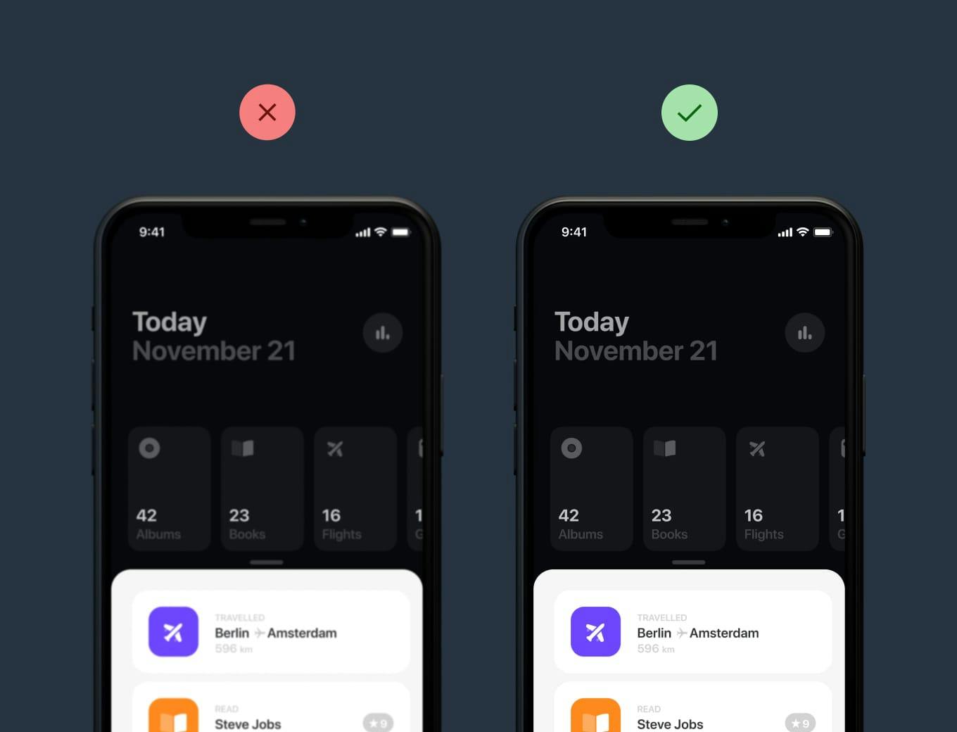
Hot Tip #45 is don’t neglect Retina optimization.

Simply put, Retina Displays have higher density pixels, needing a bigger version of the imagery to appear crisp.

Retina comparison Retina comparison

Clear infographics and crisp app screenshots leave a wonderful first impression, especially if your target market is designers.

  • A guide to <picture> and srcset – Developer Eric Portis details exactly how to deliver @2x images on Retina screens.
  • SVG Optimization Tool – SVG icons are a smart way to keep them crisp on all screens. ImageOptim has an excellent optimization function where you simply drag the SVG file in and it automatically cleans it up.
  • BGJar – Free online tool to create SVG backgrounds, keeping everything crisp on Retina screens.

Keep brand capitalization consistent

Hot Tip #48 is to keep brand capitalization consistent.

Landing Pages with different case variations of the brand name look unprofessional and can be confusing.

✅ Starbucks
🚫 Star Bucks
🚫 starbucks
🚫 StarBucks
🚫 STARBUCKS

Avoid ALL CAPS if you can. And once you’ve chosen a case style, stick with it to ensure it’s consistent throughout your Landing Page.

Keep vertical spacing even

Hot Tip #49 is to keep vertical spacing even.

The vertical padding between your Landing Page section dividers is often overlooked:

Vertical Spacing Demo Vertical Spacing Demo

A simple yet consistent spacing rule, applied throughout the long-scrolling page, can really tighten up the design.

The end.

There are no more Hot Tips to load in this archive.

Next