You are browsing:
Design Hot Tips
Landing Page lessons related to the overall page design. When you are further with your design, kick off the Landing Page Design Checklist.

Fewer images, better images

Hot Tip #03 is to use fewer images but also better images.

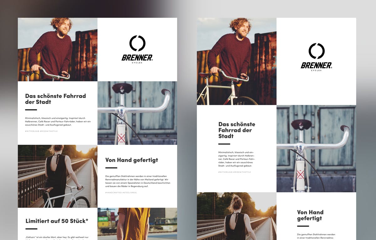
Good imagery builds trust, and trust is the foundation for conversions. When it comes to your visuals — spend the money!

Dona Rita website Logoswift website

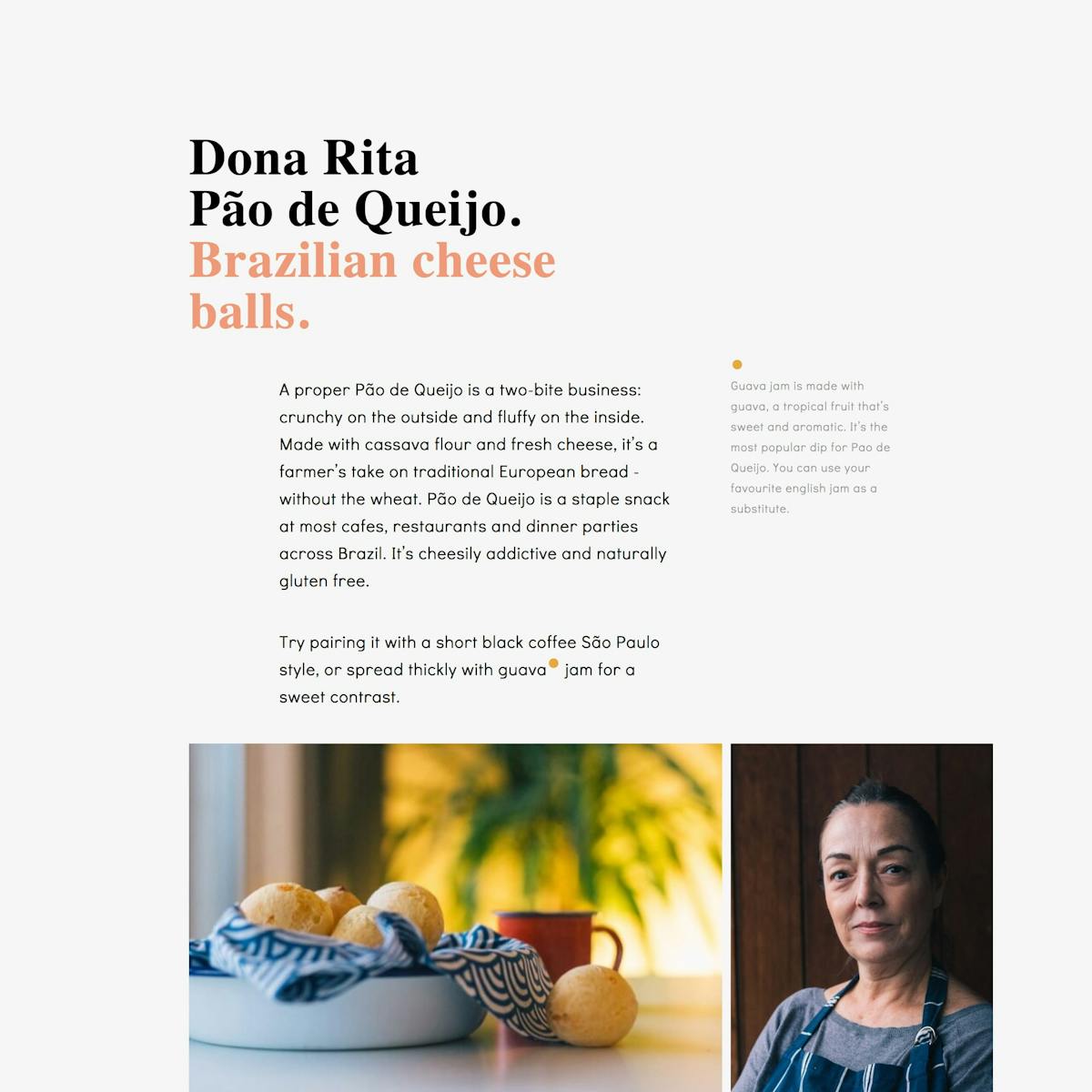
Invest in a photoshoot of your team, your product, your food. The ROI on a professional photoshoot is pretty much guaranteed.

  • ImageOptim – My go-to for image size optimization for JPG, GIF, PNG and SVG.
  • Optimage – An alternative image size optimization tool by Vlad Danilov. Conveniently optimizes MP4 too.
  • Stocksy – My favorite premium resource for stock images. If you only need a single authentic image for your Landing Page, seriously consider starting here.
  • Squareshot – Service to send your physical product and they’ll send back top quality photos of it for your Landing Page.
  • Noun Project Photos – Just launched so a good resource of less-used, quality stock imagery. Pricing is around $33/image for commercial use.
  • Unsplash – High quality, well curated free stock images.
  • Pixabay and Pexels – Both good free stock image alternatives if a search term isn’t winning on Unsplash. Both include stock video too.
  • Team Section Inspiration – A collection I put together with 20+ team sections in Landing Pages.
  • IMGIX – Image CDN’s are a bit excessive in most Landing Pages but I use IMGIX for my full network of sites. The real benefit is you can upload a big image once, then manipulate (size, compression) the output using only code. I cannot recommend it enough and I do use it for Landing Pages within my bigger sites.

When in doubt, double the padding

Hot Tip #05 is when in doubt, double the padding.

Whitespace isn’t just breathing room for your content, it’s breathing room for your potential customer.

Digestible content improves focus and clarifies what you’re offering.

Whitespace reference

If your Landing Page feels overwhelming, double the padding and I think you’ll be pleasantly surprised.

Avoid center-aligned or justified paragraphs

Hot Tip #07 is to avoid center-aligned or justified paragraph text.

When applied to long paragraphs, these two alignments can be difficult to read. This can result in fatigue while browsing Landing Pages with a lot of content.

Let Neil deGrasse Tyson take us through it:

🚫 Center-aligned

We think scientific literacy flows out of how many science facts can you recite rather than how was your brain wired for thinking. And it’s the brain wiring that I’m more interested in rather than the facts that come out of the curriculum or the lesson plan that’s been proposed.

✅ Left-aligned

We think scientific literacy flows out of how many science facts can you recite rather than how was your brain wired for thinking. And it’s the brain wiring that I’m more interested in rather than the facts that come out of the curriculum or the lesson plan that’s been proposed.

🚫 Justified

You have people who believe they are scientifically literate but, in fact, are not. And I don’t mind if you’re not scientifically literate, but just admit that to yourself, so that you’ll know, and perhaps you can take a first step to try to eradicate that. You have people who believe they are scientifically literate but, in fact, are not. And I don’t mind if you’re not scientifically literate, but just admit that to yourself, so that you’ll know, and perhaps you can take a first step to try to eradicate that.

✅ Left-aligned

You have people who believe they are scientifically literate but, in fact, are not. And I don’t mind if you’re not scientifically literate, but just admit that to yourself, so that you’ll know, and perhaps you can take a first step to try to eradicate that. You have people who believe they are scientifically literate but, in fact, are not. And I don’t mind if you’re not scientifically literate, but just admit that to yourself, so that you’ll know, and perhaps you can take a first step to try to eradicate that.

A good rule-of-thumb is that any paragraph with more than two lines should be left- or right-aligned.

  • Rags, Widows & Orphans – Kinda inappropriate naming but a good read on certain paragraph shapes and styles to avoid.

Create a text color hierarchy

Hot Tip #10 is to create a text color hierarchy.

The biggest tell a Landing Page was built by someone with little design experience is black text with maximum contrast on a white background:

Maximum contrast example

Soften the blow with an off-white background and a subtle grey/color text hierarchy:

Subtle contrast example

Some time spent here goes a long way towards creating a more pleasurable reading experience for your visitor.

  • Contrast for Mac – Great tool I’ve been using to to ensure my text color hierarchies are within Accessibility standards.
  • Accessible Color Generator – Useful to find the nearest accessible-passing color based on your color inputs (that are failing).

The end.

There are no more Hot Tips to load in this archive.

Next