Reassure during checkout
Hot Tip #72 is to reassure your visitors during the checkout process.
Nerves are high. Settle them with these small reminders, strategically positioned near the checkout form:
⭐️ The average customer star rating
🍏 A small stack of well-known client logos
💳 A payment-related FAQ
💬 A short but comforting testimonial
Also, try to include anything that adds transparency to the experience. This can alleviate any lingering doubts the visitor may have.
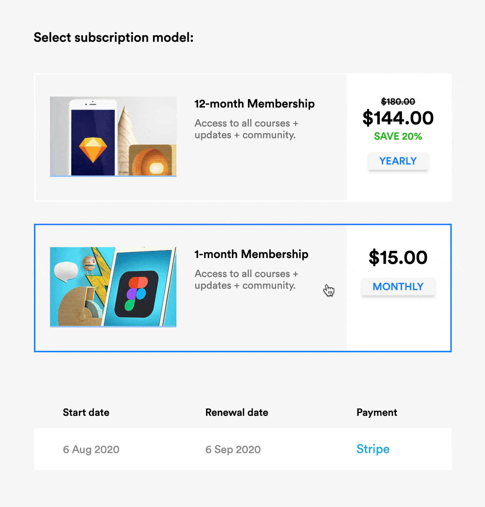
Note how LearnUX reassures by showing you exactly how the payment will appear on your statement — including the renewal date differences between tiers:
If checkout customization isn’t possible in your Landing Page, the above would still apply to the area around your pricing table or final CTA button.