Create a text color hierarchy
Hot Tip #10 is to create a text color hierarchy.
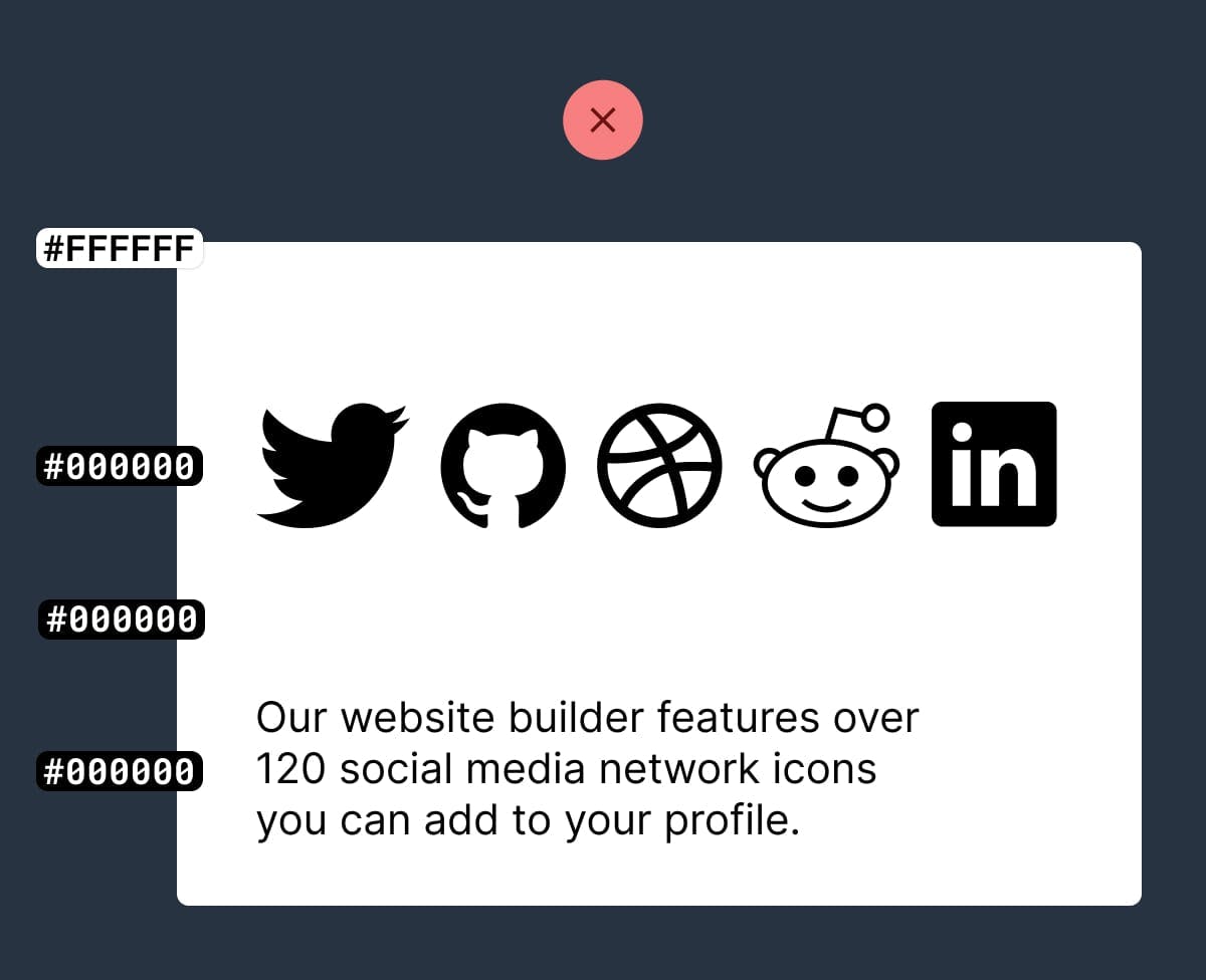
The biggest tell a Landing Page was built by someone with little design experience is black text with maximum contrast on a white background:
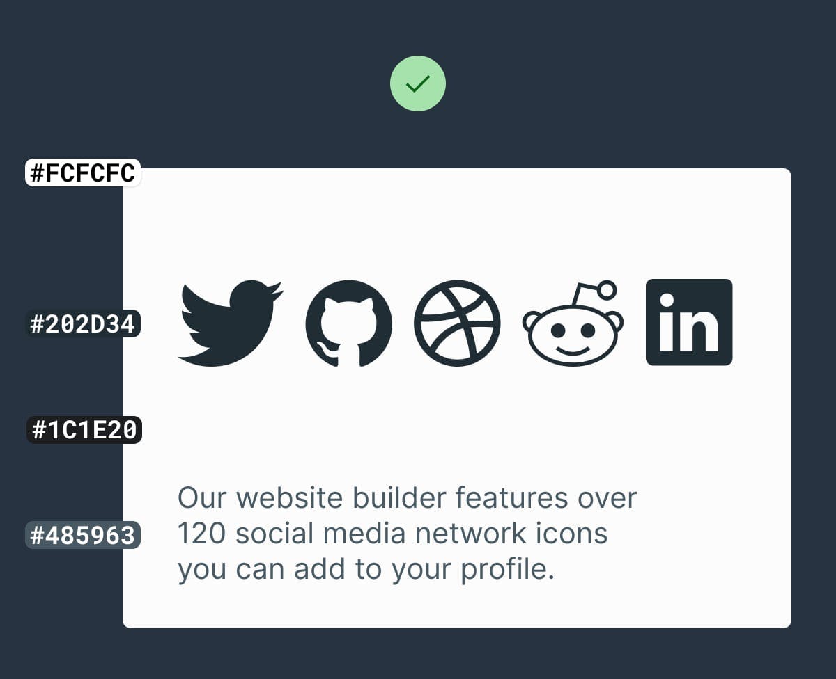
Soften the blow with an off-white background and a subtle grey/color text hierarchy:
Some time spent here goes a long way towards creating a more pleasurable reading experience for your visitor.
- Contrast for Mac – Great tool I’ve been using to to ensure my text color hierarchies are within Accessibility standards.
- Accessible Color Generator – Useful to find the nearest accessible-passing color based on your color inputs (that are failing).