You are browsing:
Design Hot Tips
Landing Page lessons related to the overall page design. When you are further with your design, kick off the Landing Page Design Checklist.

Add personality

Hot Tip #29 is to add personality.

👩‍🎤 A portrait of the person who developed the service.
📑 The desk where these posters were illustrated.
✍️ Even adding a subtle animation of your signature.

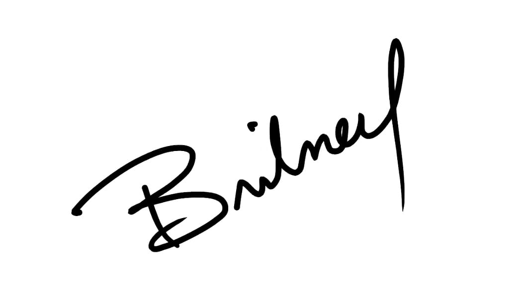
Signature demo Signature demo

People want to support people, and these little touches give visitors a glimpse of the human behind the Landing Page.

  • Fiverr – Get an animation of your signature commissioned for $5.
  • VideoTouch — An alternative approach to adding personality where you can have fun explaining the product or service in the corner of the Landing Page. The service is free for up to 5k visits a month.
  • Sign your work – Little 2014 nugget blog post by Seth Godin.

Align with a grid

Hot Tip #36 is to align with a grid.

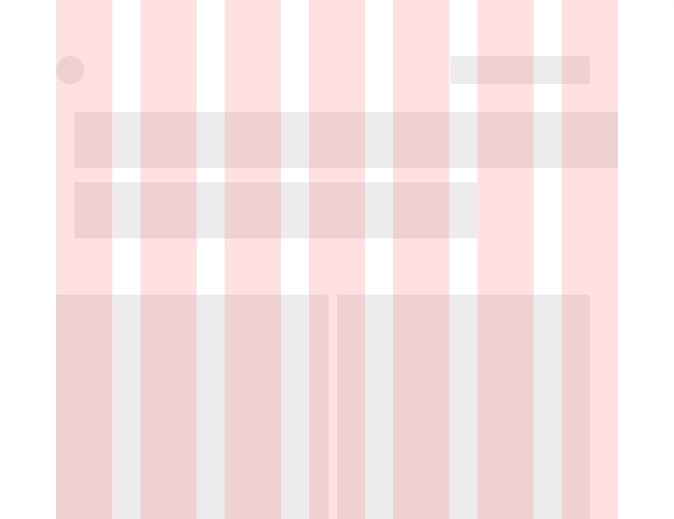
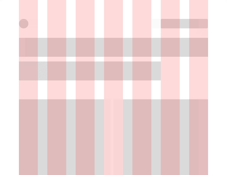
Layout grids keep your Landing Page tidy by positioning within constraints.

Grid demo

Grid demo
Grid demo
Grid demo
Grid demo

  • Material Design – Google’s Material Design initiative does a great job of explaining the differences between columns, gutters, and margins.
  • 8-Point Grid System – Very good visual breakdown by Elliot Dahl of the benefits an 8pt system give a design.
  • CSS Grid Layout Guide – The most powerful layout system available in CSS. A comprehensive breakdown by CSS-Tricks.
  • 1200px & 960px – The original grid systems we all used to reference.
  • History of grids in Graphic Design – The brief evolution on Wikipedia.

Add a splash of color

Hot Tip #37 is to add a splash of color.

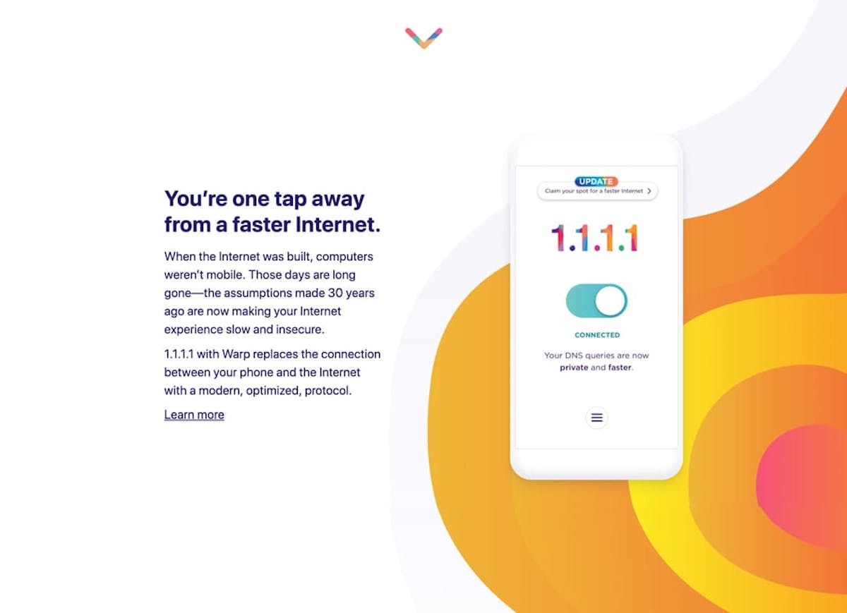
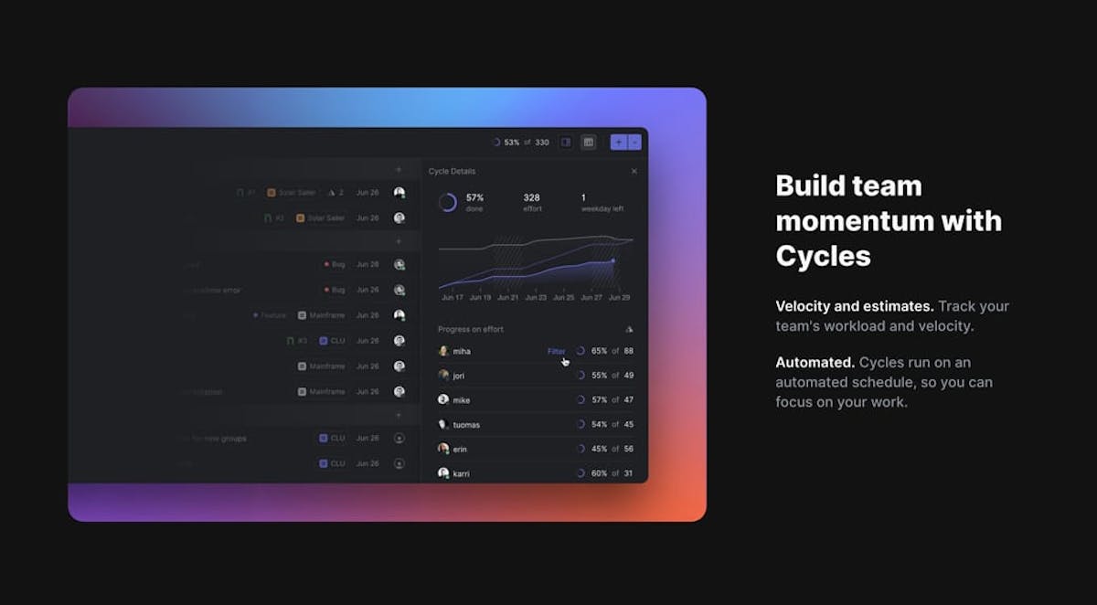
A burst on a Landing Page can command attention and add excitement.

Color splash reference Color splash reference Color splash reference

And when excited, we tend to try new things.

  • Color Scheme Inspiration – A collection of 700+ Landing Pages I’ve curated featuring colorful schemes.
  • BGJar – Free online tool to create colorful SVG blobs.

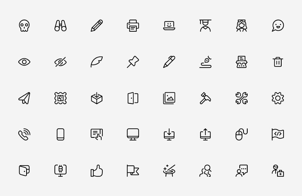
Invest in an icon library

Hot Tip #38 is to invest in an icon library.

Having a go-to icon pack can speed up Landing Page development and keep the aesthetic consistent.

Streamline Icons
  • Streamline Icons – My personal favorite (pictured above). Owner Vincent and his team have spent a zillion hours putting together this comprehensive 30,000+ resource with 3 weights.
  • Iconfinder – Solid resource for finding and icon style you like first, then purchasing. Lots of free ones in sets in here too.
  • Font Awesome – Another quality library. I backed them on Kickstarter in 2017 and still using the odd icon. The site UI is very impressive and continuously being worked on.

The end.

There are no more Hot Tips to load in this archive.

Next