Avoid animation overkill
Hot Tip #21 is to avoid animation overkill.
Gratuitous scroll transitions no longer impress. Subtle animations are timeless and show intent.
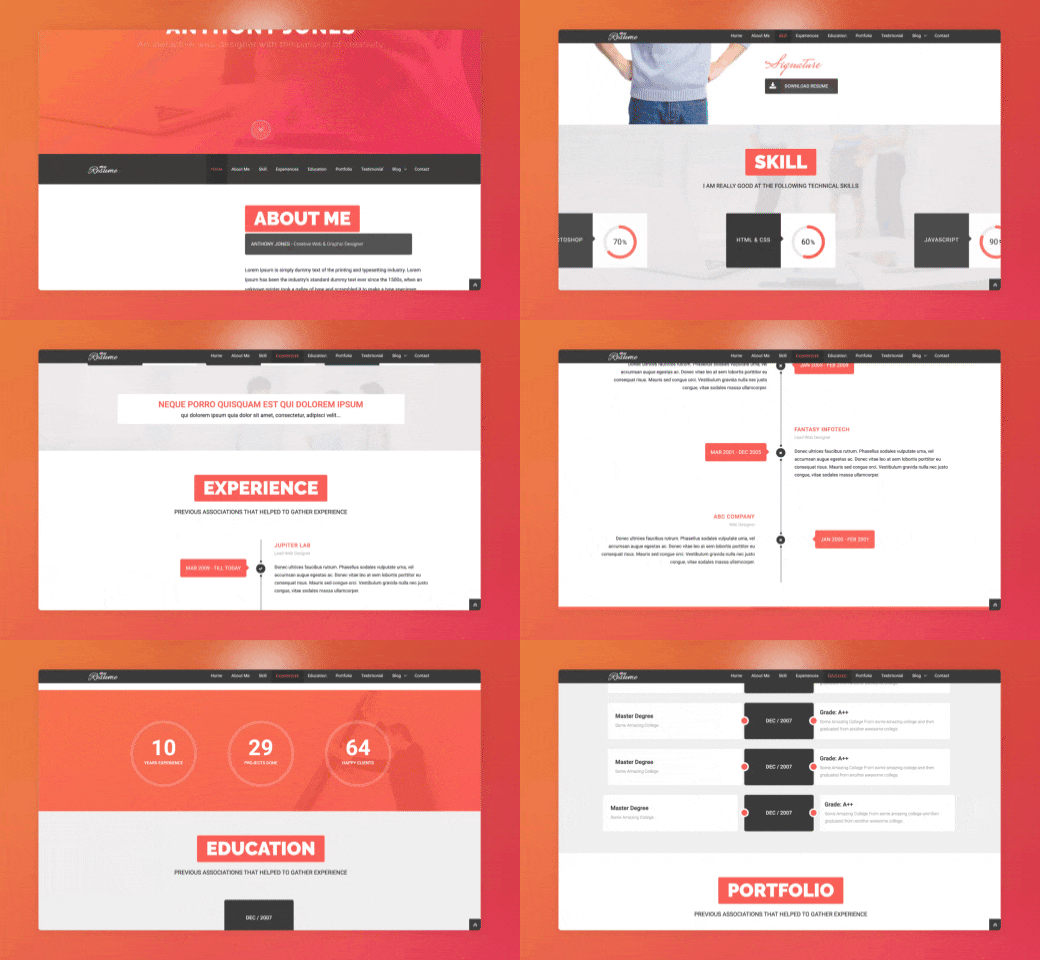
Just because you can, doesn’t mean you should.
Hot Tip #21 is to avoid animation overkill.
Gratuitous scroll transitions no longer impress. Subtle animations are timeless and show intent.

Just because you can, doesn’t mean you should.
Hot Tip #25 is to integrate a sticky header navigation if your Landing Page is long.
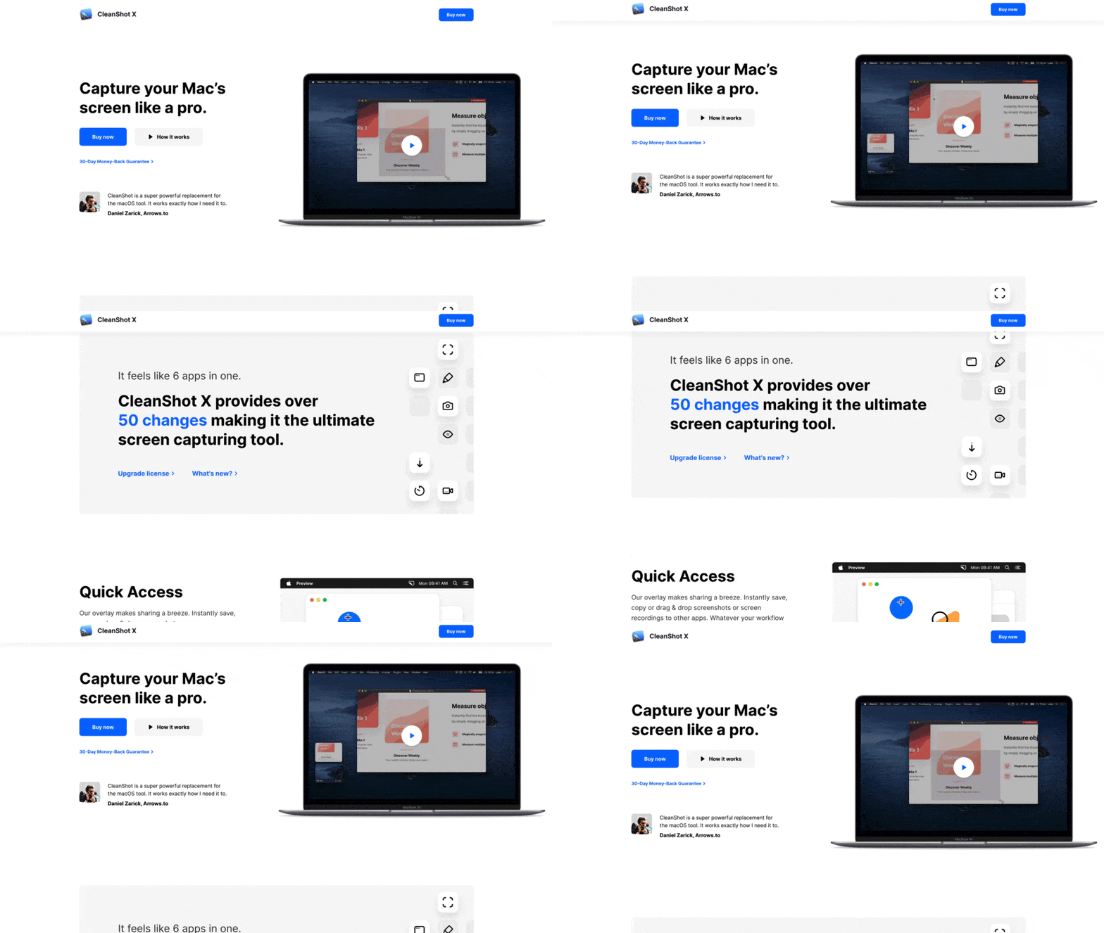
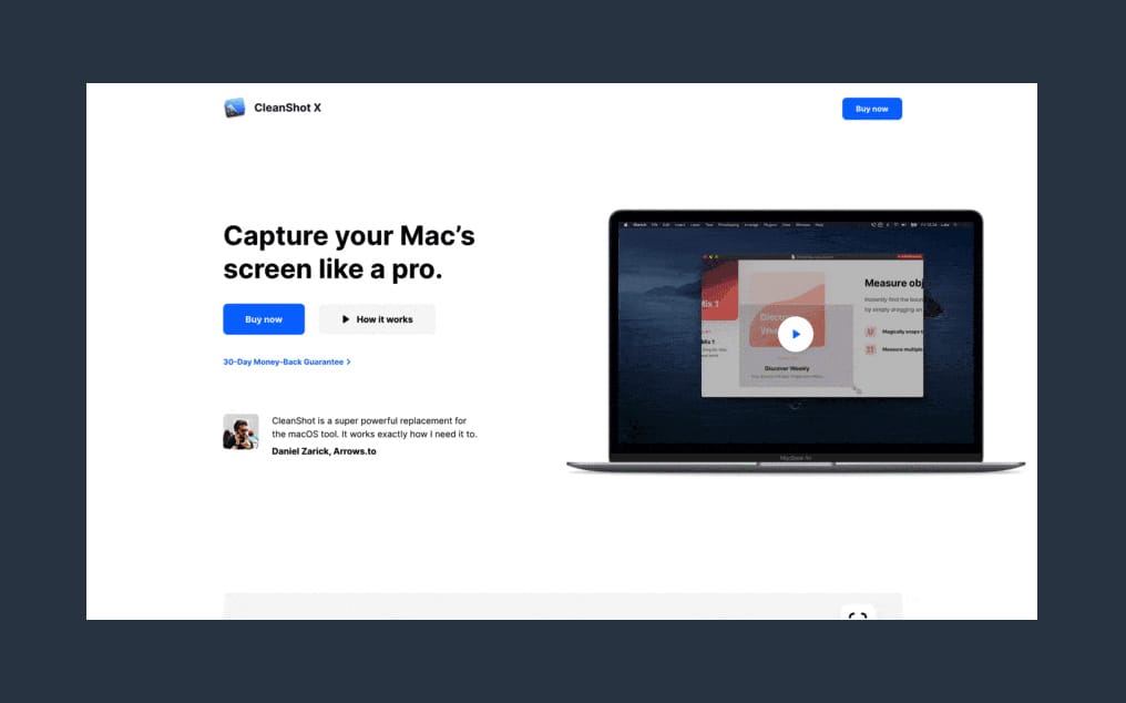
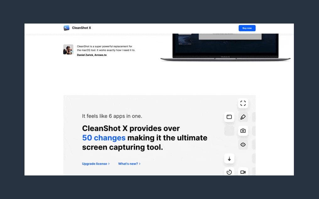
A sticky header can make it easier for visitors to navigate page sections and keeps that CTA button visible at all times.
Hot Tip #39 is to place copy before images on mobile.
Having a legible responsive design is great, but are you ordering your content for a seamless scrolling experience on mobile?
✅ Intro copy before main image
✅ Feature copy before demo image
Landing Page images without context are difficult to decipher:

P.S. Don’t be afraid to hide images (or text) that add nothing to the mobile experience.
Hot Tip #46 is to remove obstacles in the way of demoing your product.
Carrd allows a full website build before asking for an email address.
You are confident your SaaS offering will satisfy your potential customer. Why not get visitors to experience it as soon as possible?